Responsive Design
This is the second article in a series of articles about three.js. The first article was about fundamentals. If you haven't read that yet you might want to start there.
This article is about how to make your three.js app be responsive to any situation. Making a webpage responsive generally refers to the page displaying well on different sized displays from desktops to tablets to phones.
For three.js there are even more situations to consider. For example, a 3D editor with controls on the left, right, top, or bottom is something we might want to handle. A live diagram in the middle of a document is another example.
The last sample we had used a plain canvas with no CSS and no size
<canvas id="c"></canvas>
That canvas defaults to 300x150 CSS pixels in size.
In the web platform the recommended way to set the size of something is to use CSS.
Let's make the canvas fill the page by adding CSS
<style>
html, body {
   margin: 0;
   height: 100%;
}
#c {
   width: 100%;
   height: 100%;
   display: block;
}
</style>
In HTML the body has a margin of 5 pixels by default so setting the margin to 0 removes the margin. Setting the html and body height to 100% makes them fill the window. Otherwise they are only as large as the content that fills them.
Next we tell the id=c element to be
100% the size of its container which in this case is the body of
the document.
Finally we set its display mode to block. A canvas's
default display mode is inline. Inline
elements can end up adding whitespace to what is displayed. By
setting the canvas to block that issue goes away.
Here's the result
You can see the canvas is now filling the page but there are 2 problems. One our cubes are stretched. They are not cubes they are more like boxes. Too tall or too wide. Open the example in its own window and resize it. You'll see how the cubes get stretched wide and tall.
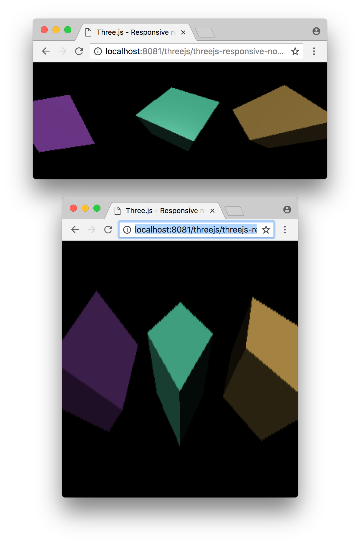
The second problem is they look low resolution or blocky and blurry. Stretch the window really large and you'll really see the issue.

Let's fix the stretchy problem first. To do that we need
to set the aspect of the camera to the aspect of the canvas's
display size. We can do that by looking at the canvas's
clientWidth and clientHeight properties.
We'll update our render loop like this
function render(time) {
  time *= 0.001;

+  const canvas = renderer.domElement;
+  camera.aspect = canvas.clientWidth / canvas.clientHeight;
+  camera.updateProjectionMatrix();

  ...
Now the cubes should stop being distorted.
Open the example in a separate window and resize the window and you should see the cubes are no longer stretched tall or wide. They stay the correct aspect regardless of window size.
Now let's fix the blockiness.
Canvas elements have 2 sizes. One size is the size the canvas is displayed on the page. That's what we set with CSS. The other size is the number of pixels in the canvas itself. This is no different than an image. For example we might have a 128x64 pixel image and using CSS we might display as 400x200 pixels.
<img src="some128x64image.jpg" style="width:400px; height:200px">
A canvas's internal size, its resolution, is often called its drawingbuffer size.
In three.js we can set the canvas's drawingbuffer size by calling renderer.setSize.
What size should we pick? The most obvious answer is "the same size the canvas is displayed".
Again, to do that we can look at the canvas's clientWidth and clientHeight
properties.
Let's write a function that checks if the renderer's canvas is not already the size it is being displayed as and if so set its size.
function resizeRendererToDisplaySize(renderer) {
  const canvas = renderer.domElement;
  const width = canvas.clientWidth;
  const height = canvas.clientHeight;
  const needResize = canvas.width !== width || canvas.height !== height;
  if (needResize) {
    renderer.setSize(width, height, false);
  }
  return needResize;
}
Notice we check if the canvas actually needs to be resized. Resizing the canvas is an interesting part of the canvas spec and it's best not to set the same size if it's already the size we want.
Once we know if we need to resize or not we then call renderer.setSize and
pass in the new width and height. It's important to pass false at the end.
renderer.setSize by default sets the canvas's CSS size but doing so is not
what we want. We want the browser to continue to work how it does for all other
elements which is to use CSS to determine the display size of the element. We don't
want canvases used by three to be different than other elements.
Note that our function returns true if the canvas was resized. We can use this to check if there are other things we should update. Let's modify our render loop to use the new function
function render(time) {
  time *= 0.001;

+  if (resizeRendererToDisplaySize(renderer)) {
+    const canvas = renderer.domElement;
+    camera.aspect = canvas.clientWidth / canvas.clientHeight;
+    camera.updateProjectionMatrix();
+  }

  ...
Since the aspect is only going to change if the canvas's display size
changed we only set the camera's aspect if resizeRendererToDisplaySize
returns true.
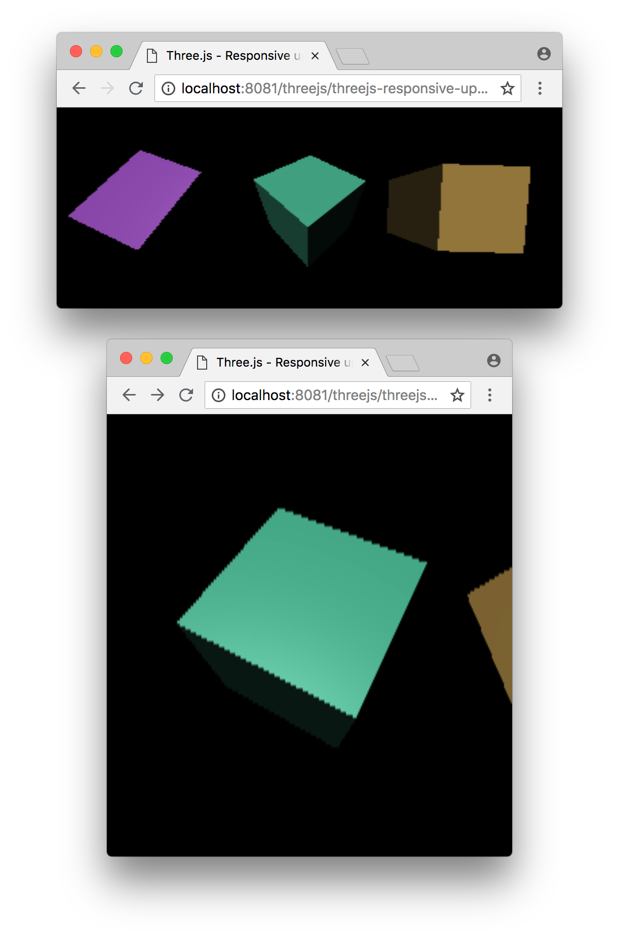
It should now render with a resolution that matches the display size of the canvas.
To make the point about letting CSS handle the resizing let's take
our code and put it in a separate .js file.
Here then are a few more examples where we let CSS choose the size and notice we had
to change zero code for them to work.
Let's put our cubes in the middle of a paragraph of text.
and here's our same code used in an editor style layout where the control area on the right can be resized.
The important part to notice is no code changed. Only our HTML and CSS changed.
Handling HD-DPI displays
HD-DPI stands for high-density dot per inch displays. That's most Macs nowadays and many Windows machines as well as pretty much all smartphones.
The way this works in the browser is they use CSS pixels to set the sizes which are supposed to be the same regardless of how high res the display is. The browser will just render text with more detail but the same physical size.
There are various ways to handle HD-DPI with three.js.
The first one is just not to do anything special. This is arguably the most common. Rendering 3D graphics takes a lot of GPU processing power. Mobile GPUs have less power than desktops, at least as of 2018, and yet mobile phones often have very high resolution displays. The current top of the line phones have an HD-DPI ratio of 3x meaning for every one pixel from a non-HD-DPI display those phones have 9 pixels. That means they have to do 9x the rendering.
Computing 9x the pixels is a lot of work so if we just leave the code as it is we'll compute 1x the pixels and the browser will just draw it at 3x the size (3x by 3x = 9x pixels).
For any heavy three.js app that's probably what you want otherwise you're likely to get a slow framerate.
That said if you actually do want to render at the resolution of the device there are a couple of ways to do this in three.js.
One is to tell three.js a resolution multiplier using renderer.setPixelRatio.
You ask the browser what the multiplier is from CSS pixels to device pixels
and pass that to three.js
renderer.setPixelRatio(window.devicePixelRatio);
After that any calls to renderer.setSize will magically
use the size you request multiplied by whatever pixel ratio
you passed in. This is strongly NOT RECOMMENDED. See below
The other way is to do it yourself when you resize the canvas.
    function resizeRendererToDisplaySize(renderer) {
      const canvas = renderer.domElement;
      const pixelRatio = window.devicePixelRatio;
      const width  = Math.floor( canvas.clientWidth  * pixelRatio );
      const height = Math.floor( canvas.clientHeight * pixelRatio );
      const needResize = canvas.width !== width || canvas.height !== height;
      if (needResize) {
        renderer.setSize(width, height, false);
      }
      return needResize;
    }
This second way is objectively better. Why? Because it means I get what I ask for.
There are many cases when using three.js where we need to know the actual
size of the canvas's drawingBuffer. For example when making a post processing filter,
or if we are making a shader that accesses gl_FragCoord, if we are making
a screenshot, or reading pixels for GPU picking, for drawing into a 2D canvas,
etc... There are many cases where if we use setPixelRatio then our actual size will be different
than the size we requested and we'll have to guess when to use the size
we asked for and when to use the size three.js is actually using.
By doing it ourselves we always know the size being used is the size we requested.
There is no special case where magic is happening behind the scenes.
Here's an example using the code above.
It might be hard to see the difference but if you have an HD-DPI display and you compare this sample to those above you should notice the edges are more crisp.
HD-DPI: Limiting maximum drawing buffer size
When using a fractional UI scaling factor on some operating system
(eg: 150% on OSX or Linux) the assumption that the real physical
resolution equals width * window.devicePixelRatio and
height * window.devicePixelRatio no longer holds.
This may lead to excessive GPU load, lower frame rates and high power
consumption.
A possible mitigation is to cap the maximum internal resolution (e.g. limit width × height) so the buffer remains within safe bounds.
    function resizeRendererToDisplaySize(renderer, maxPixelCount=3840*2160) {
      const canvas = renderer.domElement;
      const pixelRatio = window.devicePixelRatio;
      let width  = Math.floor( canvas.clientWidth  * pixelRatio );
      let height = Math.floor( canvas.clientHeight * pixelRatio );
      const pixelCount = width * height;
      const renderScale = pixelCount > maxPixelCount ? Math.sqrt(maxPixelCount / pixelCount) : 1;
      width = Math.floor(width * renderScale);
      height = Math.floor(height * renderScale);

      const needResize = canvas.width !== width || canvas.height !== height;
      if (needResize) {
        renderer.setSize(width, height, false);
      }
      return needResize;
    }
This article covered a very basic but fundamental topic. Next up lets quickly go over the basic primitives that three.js provides.